↳ RESEARCH
↳ WIREFRAMES
↳ PROTOTYPE
↳ MICRO-INTERACTIONS
Refine the mobile navigation experience for Anthropologie’s website.
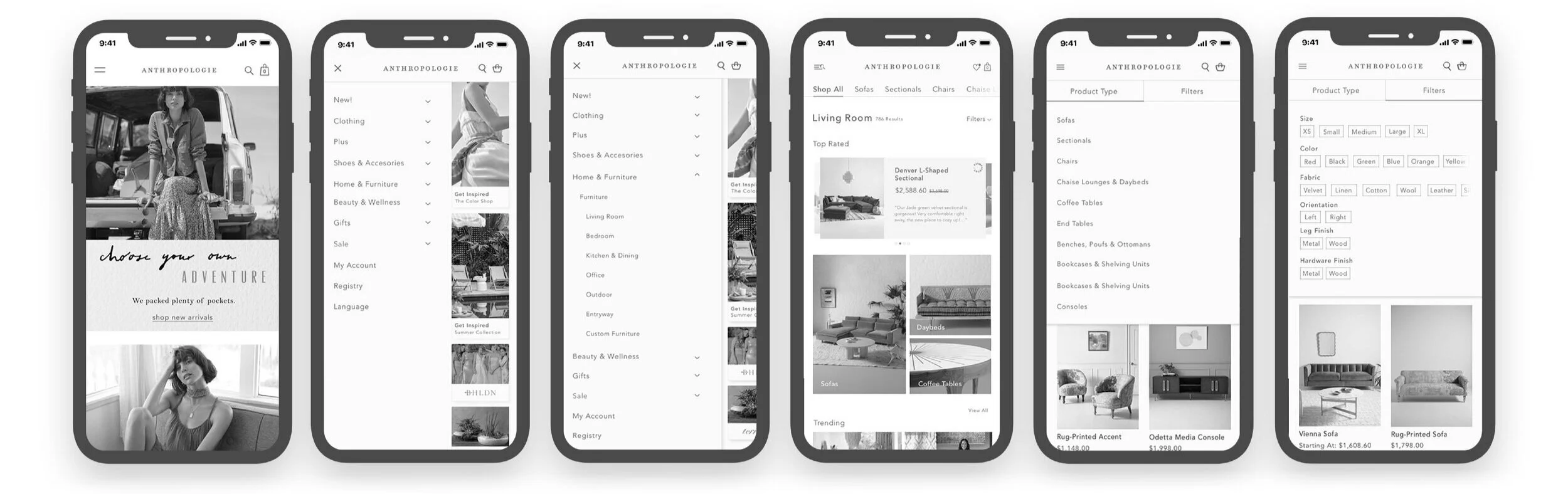
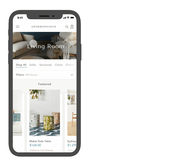
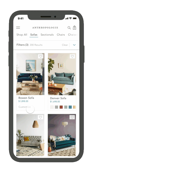
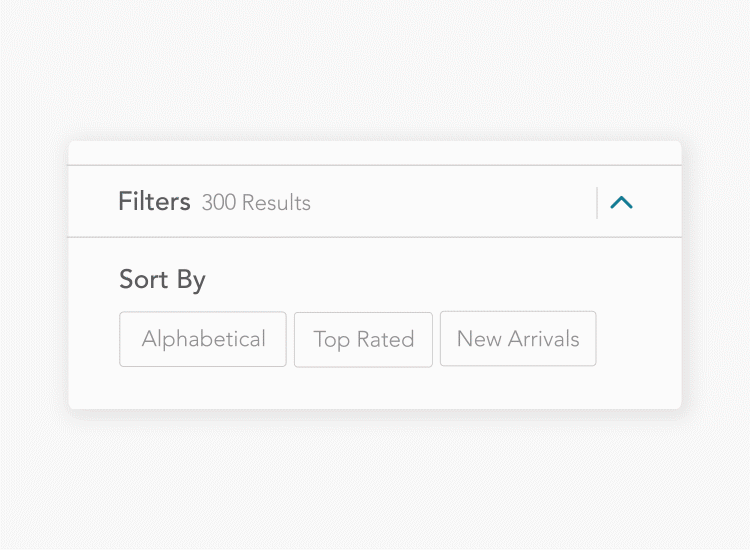
Throughout the 10-week summer internship, I went through the UX design process with the outcome of proposing an optimized filter system and an intricate navigation system to help the users find their exact product.


01.
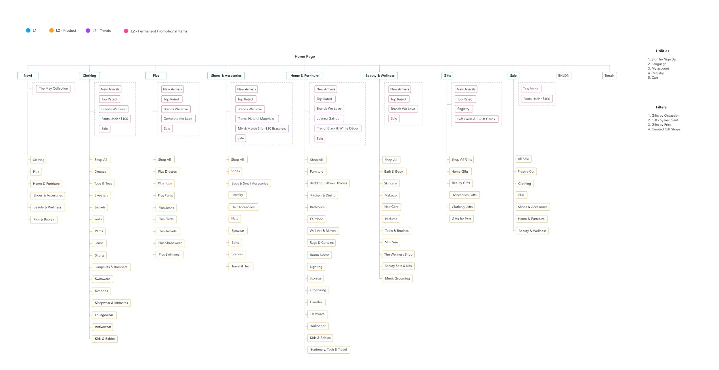
SITE MAPS
To better understand Anthropologie’s website, I visited and studied their current site map. From there, I focused on adjusting their site map taking in account the target audience and different consumer experiences.
02.
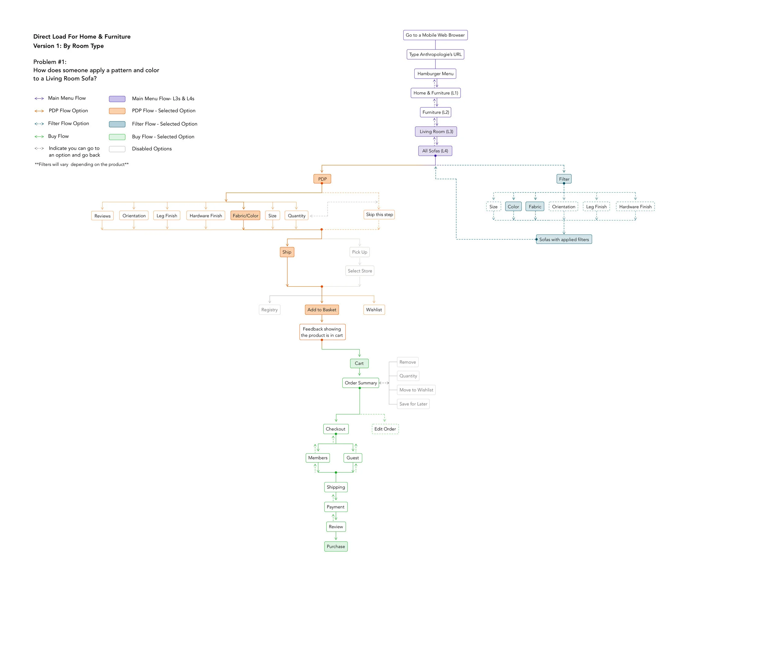
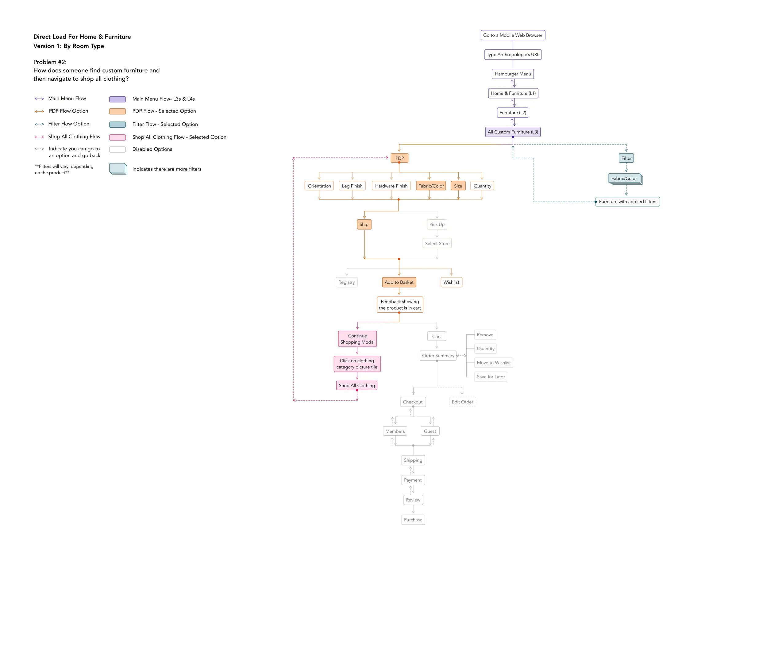
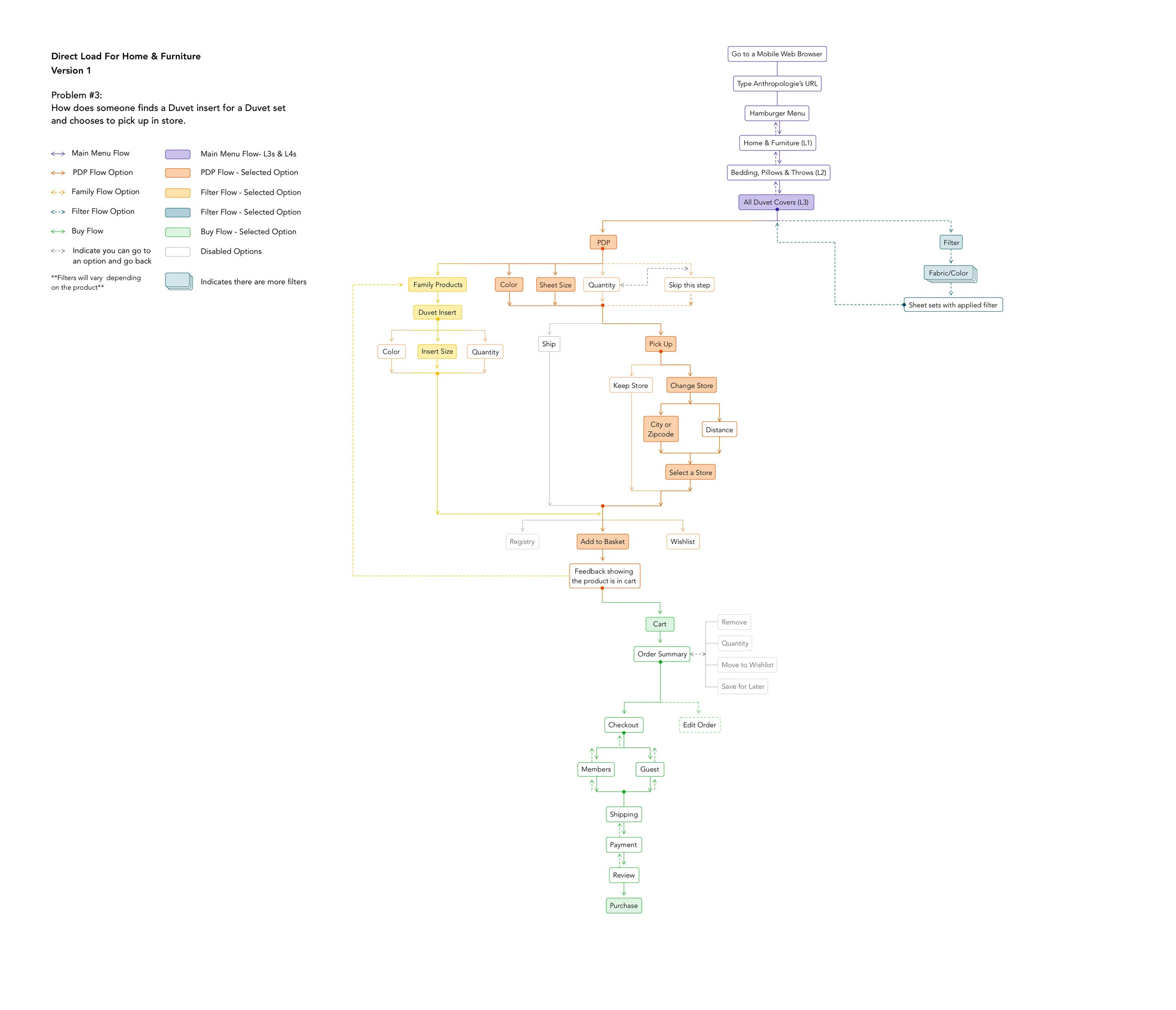
USER FLOWS
After finalizing the site maps, I began to create 3 different flows that answer to various user tasks.
TAP TO EXPAND THE SITE MAPS AND USER FLOWS ↓
03.
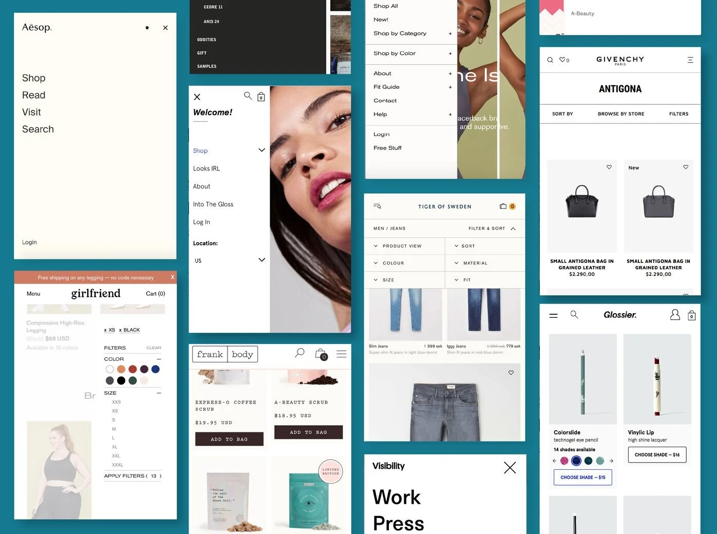
RESEARCH
Before starting the wireframes, I conducted a research to gather observations and insights on what current retail brands are doing with their mobile website. Some of the findings include:
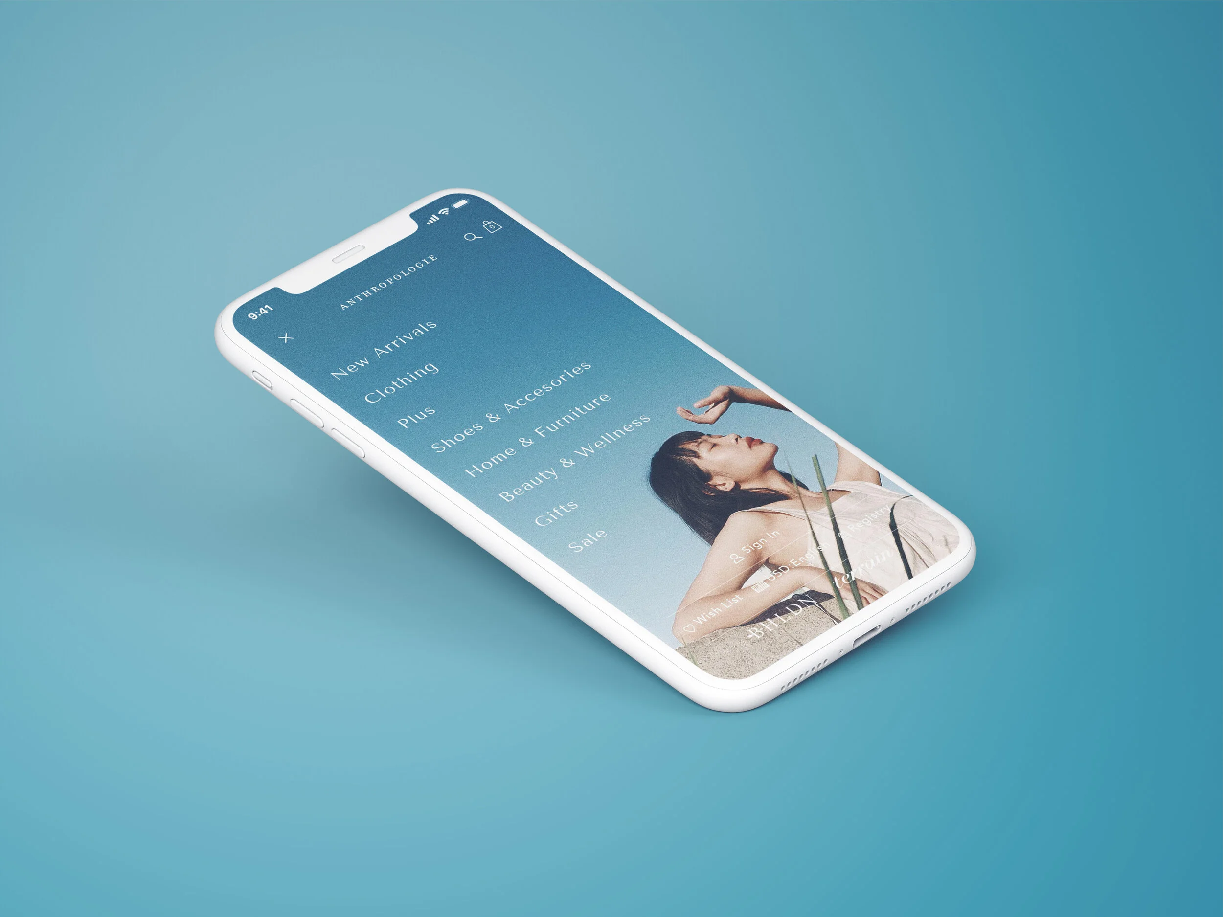
Promotional images inside hamburger menu
Utilize a secondary navigation system inside PDP,
Give importance to utility links
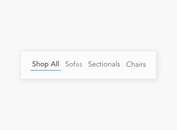
Ability to filter down a category page even when user is far from the top
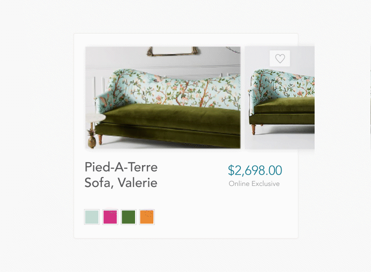
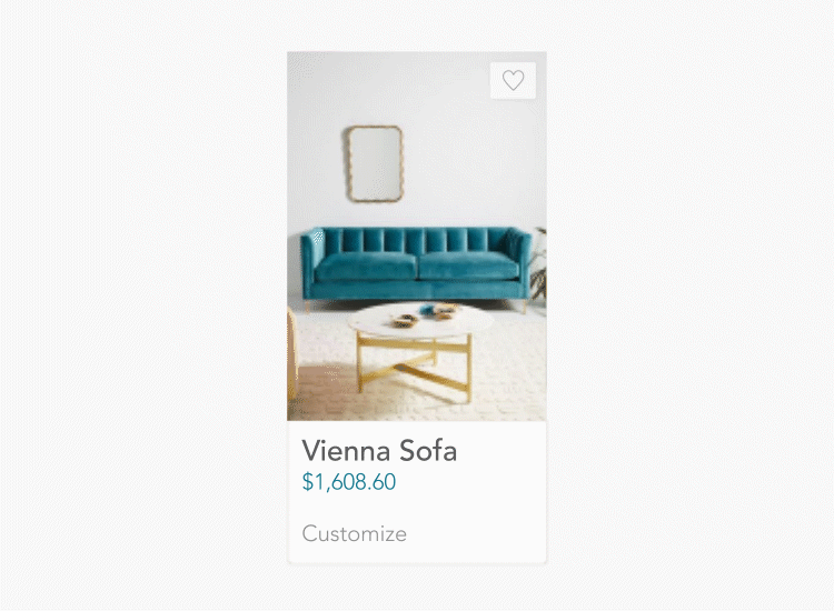
Preview color swatches without being redirected to another page
04.
INITIAL WIREFRAMES